Designer Layout
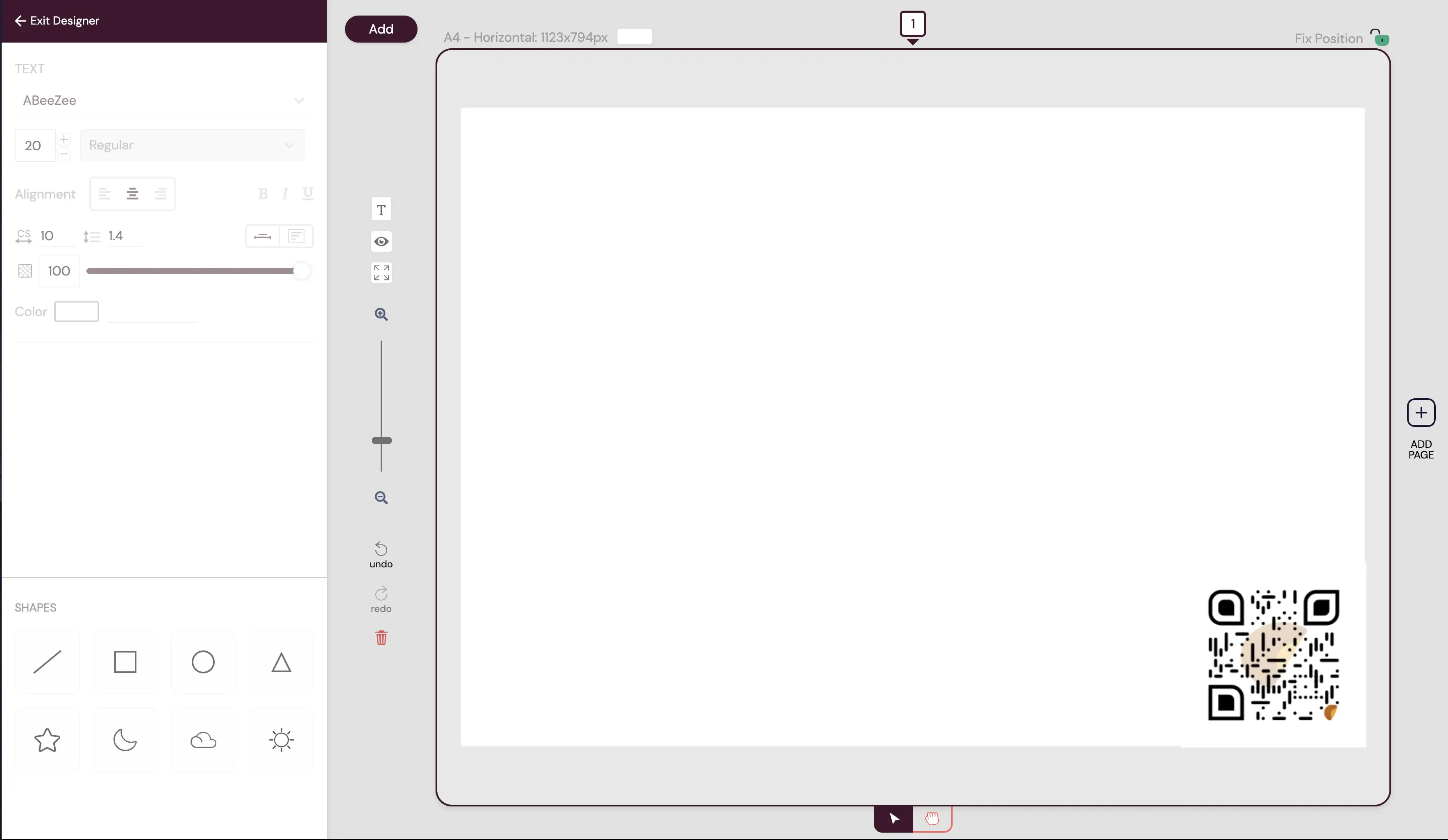
The designer layout is divided into two main sections: Control and Design.
Controls Section
Section titled “Controls Section”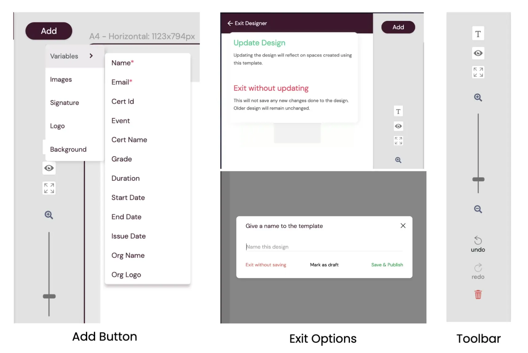
Add Button
Section titled “Add Button”The Add Button activates a dropdown menu with options to enhance template design:
- Add Variables
- Add Images
- Add Signatures
- Add Logo
- Add or Change Background
Exit Button
Section titled “Exit Button”The Exit Button allows users to exit the designer with options to save or create a copy, depending on the design scenario:
- Exiting Without Changes: Clicking the Exit Button allows users to exit the designer without making any changes.
- Saving a New Design or Updating an Existing Design: Users are presented with the “Save New Design” or “Update Existing Design” modal, allowing them to name the design, save as draft, publish, or exit without saving changes.
Template Toolbar
Section titled “Template Toolbar”The toolbar includes buttons to enhance template design:
- Add Text Button
- Preview Button
- Fit to Screen Button
- Zoom Control
- Undo and Redo Buttons
- Delete Button
Elements Property Editor
Section titled “Elements Property Editor”This dynamic section allows users to customize element properties, add images, logos, signatures, and shapes to the template. Explore Now
Design Section
Section titled “Design Section”The Design section provides interactive elements alongside the canvas, offering powerful tools to create and customize templates. Key elements include:
- Smart Page Type Detection and Page Size Display
- Background Color Picker
- Page Indicator
- Position Lock
- Add Page Button
- Edit Mode and Grab Mode Buttons
Utilizing these elements in the Design section, users can efficiently create and refine templates with ease and precision.