Elements Property Editor
Introduction
Section titled “Introduction”The Elements Property Editor is a versatile tool within Designer that allows users to customize and manage various elements in their template designs. These elements include textboxes, date-time variables, images (both PNG/JPEG and SVG), and hashmarks. Here, we’ll explore the capabilities of this editor for each element type.
Textbox Properties: View and Edit
Section titled “Textbox Properties: View and Edit”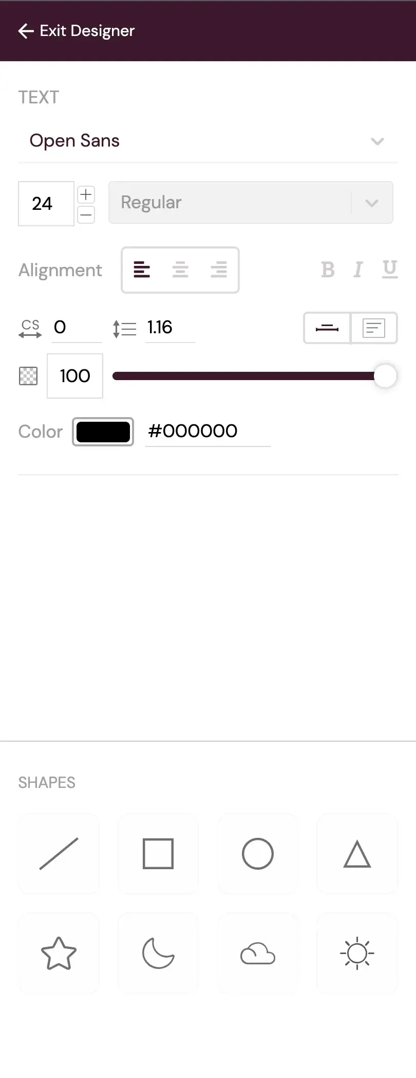
TextBox Properties
Textboxes are a fundamental component of any design. The Properties Editor offers extensive options for customizing text appearance and behavior:
-
Font Selection Dropdown: Users can choose from a variety of fonts, ensuring that text matches the desired style and branding.
-
Font Size Dropdown and Increase/Decrease Control: Font size can be easily adjusted, either by selecting predefined sizes or by dynamically increasing or decreasing it.
-
Alignment Control: This feature allows users to position text within the textbox (left, center, right) for better layout control.
-
Bold/Italic/Underline Control: Users can apply formatting styles like bold, italic, and underline to text as needed.
-
Character Spacing Control: This feature adjusts the spacing between individual characters in the text, enhancing the design’s aesthetic.
-
Line Height Control: Vertical spacing between lines of text can be customized, ensuring optimal readability and design.
-
Opacity Control: Text opacity can be managed, allowing for transparency effects or blending with the template.
-
Color Control: Users can select specific colors for text, matching the design’s color scheme.
In addition to these basic features, two distinct options for controlling textbox behavior are available:
- Scalable Textbox: This option automatically adjusts the textbox width to fit the content, allowing for easy resizing of text.
- Fixed Width Textbox: This type maintains a consistent width, accommodating text without scaling based on input. Corner controls can be used for resizing.
Date-Time Variables: Formatting and Customization
Section titled “Date-Time Variables: Formatting and Customization”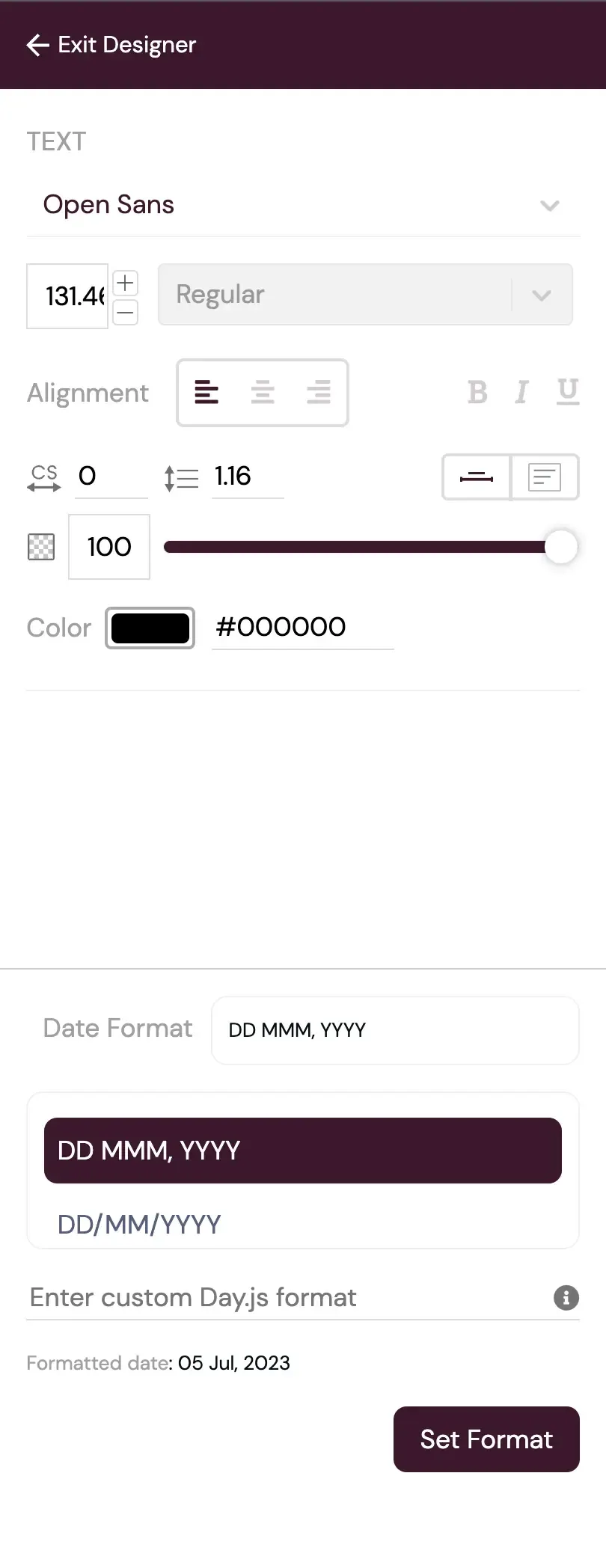
Date-Time Properties
Incorporating date-time variables into your designs offers additional functionality. The Properties Editor provides these options:
-
Predefined Format Selection: Users can quickly choose from a list of predefined date and time formats for efficient formatting.
-
Custom Day.js Format: For more specific formatting needs, users can create custom formats following the Day.js library standards, tailoring date and time displays to specific requirements.
For reference and guidance on custom formatting patterns, you can explore the Day.js documentation.
PNG and JPEG Images: Customization and Transformation
Section titled “PNG and JPEG Images: Customization and Transformation”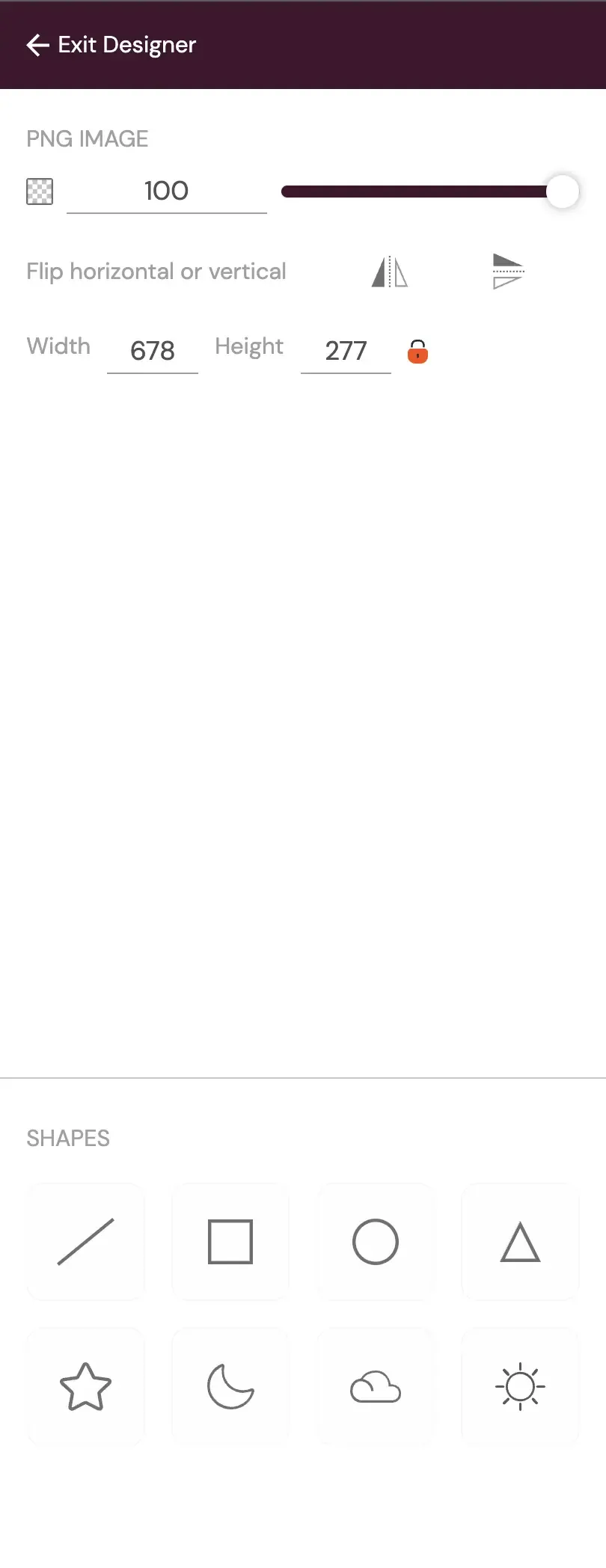
Png Properties
Adding PNG and JPEG images to your templates offers various customization possibilities:
-
Opacity Control: Users can manage image opacity, facilitating transparency or seamless integration with the template.
-
Flip Image: Images can be flipped horizontally or vertically, offering flexible image orientation.
-
Width and Height Adjustment: Images can be resized with a fixed aspect ratio or unlocked aspect ratio, allowing for proportional scaling or distortion as needed.
SVG Images: Customization and Color Control
Section titled “SVG Images: Customization and Color Control”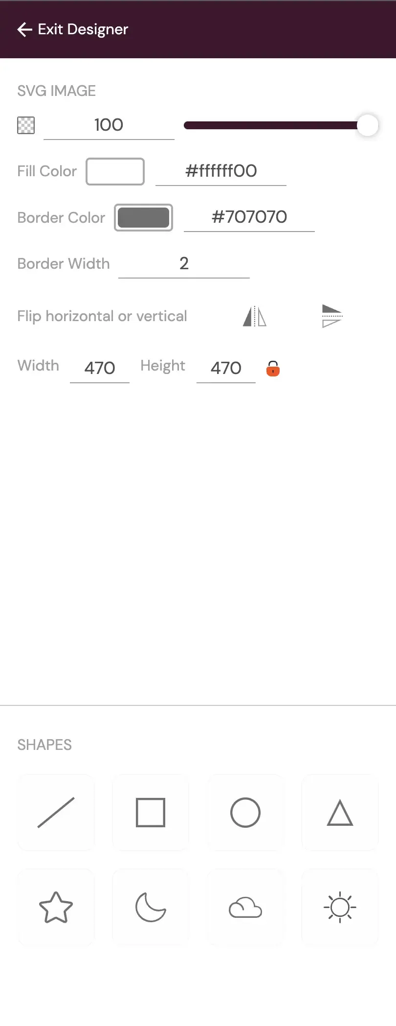
Svg Properties
SVG (Scalable Vector Graphics) images provide extensive customization options:
-
Fill Color: Users can change the fill color of SVG shapes, ensuring a wide range of color variations for design coherence.
-
Border Color: The border color of SVG images can be modified, providing additional control over visual presentation.
Please note that users also have the option to adjust the size of SVG borders, although this is currently not recommended due to potential design issues.
Adding Image Elements to the Template
Section titled “Adding Image Elements to the Template”The process of adding image elements to your template is streamlined:
-
Drag and Drop Functionality: Users can effortlessly drag and drop images from various sources, including their computers, into the template, simplifying integration.
-
Uploading Images: Images can be uploaded and categorized for easy retrieval.
-
Accessing Recently Used Images: The “Recently Used” section in the side panel offers quick access to images used in previous designs, saving time and ensuring design consistency.
Hashmark: Enhancing Verifiable Record Properties
Section titled “Hashmark: Enhancing Verifiable Record Properties”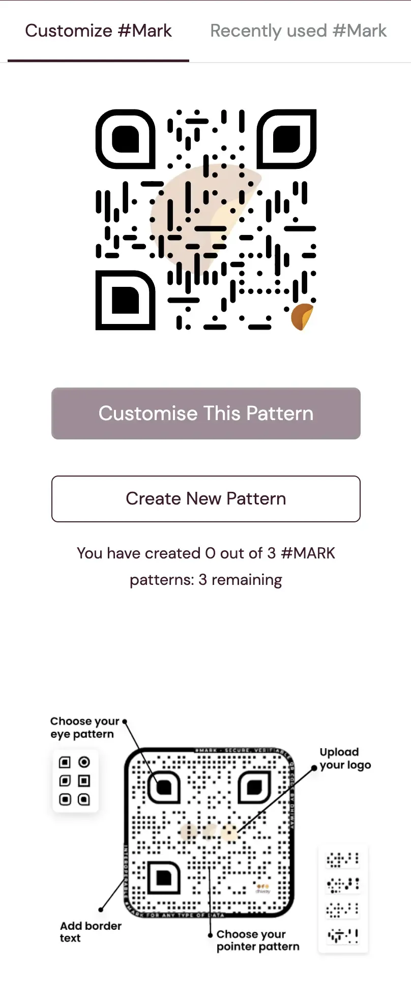
Hashmark Properties
The Hashmark side panel presents a cleaner user interface for displaying hashmark designs, action buttons: Customise this pattern and Create new pattern, and property details. These enhancement makes it easier for users to manage and work with hashmarks, ultimately enhancing verifiable record properties.
Customise Pattern
Section titled “Customise Pattern”Designs containing custom hashmark not owned by your organisation are customizable and added to your list if you have not reached the limit. clicking on customise button or edit button by hovering over a design in Recently used MARKtab opens the Customise #MARK tab where you can make the changes and save the updated design